Alternative Futures is a global Greenpeace campaign about reimagining our future through an optimistic and decolonial lens, amplifying solutions already being built by the global majority. The challenge was to create a brand that could speak to Gen X, Gen Y, and Gen Z, across cultures and continents, without flattening the diversity it was trying to celebrate.
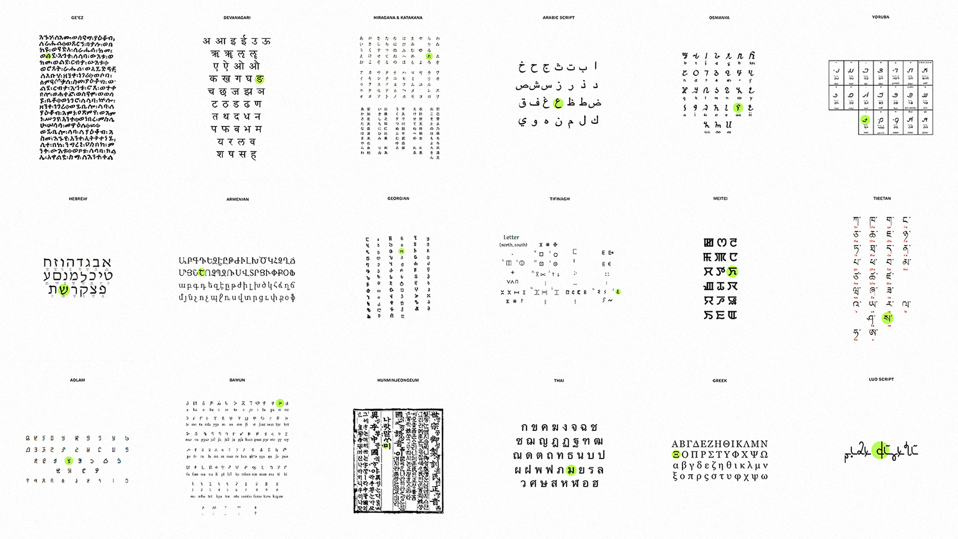
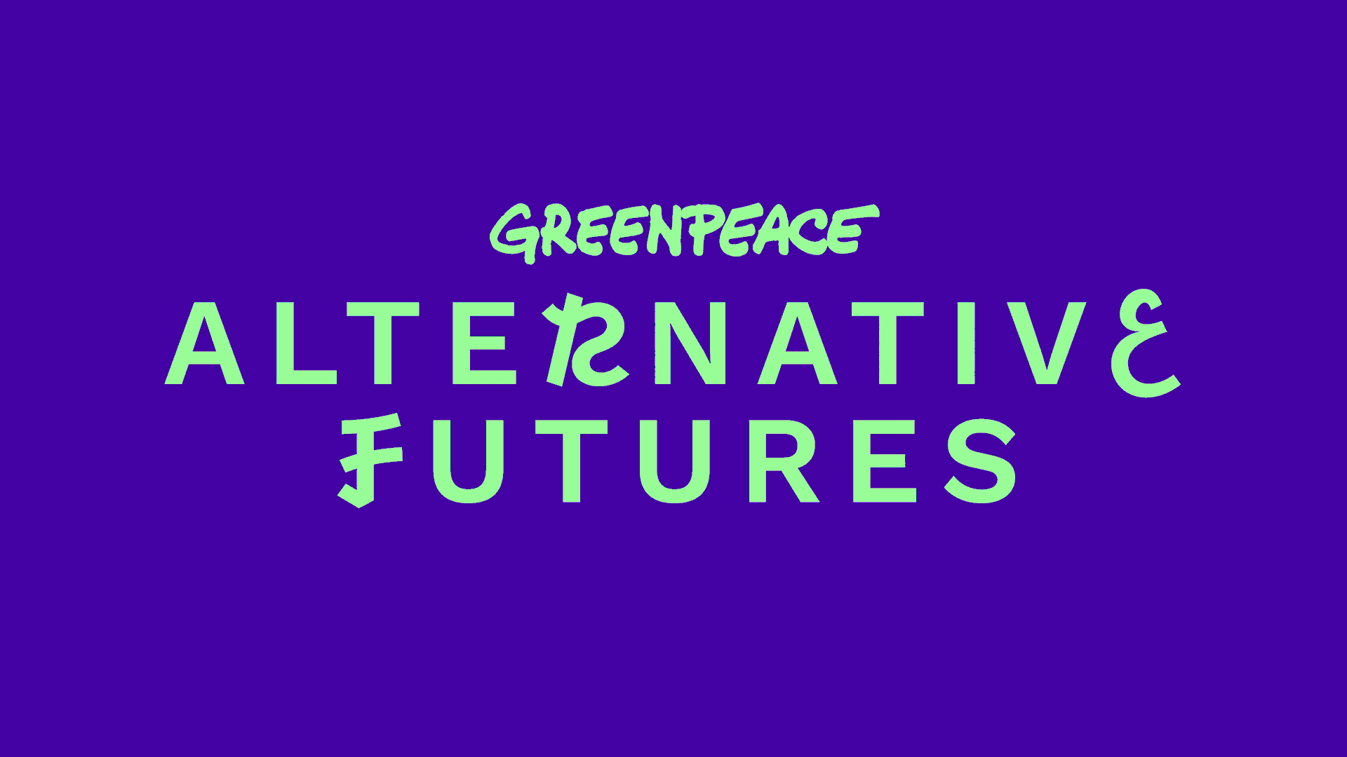
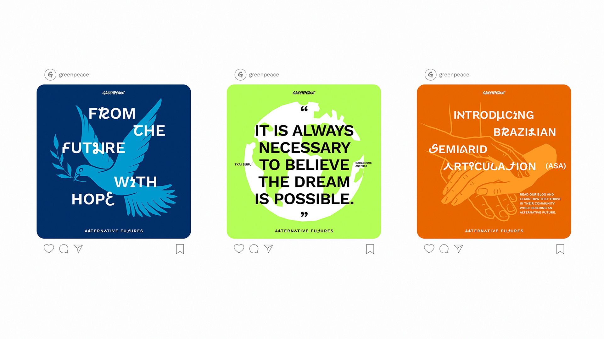
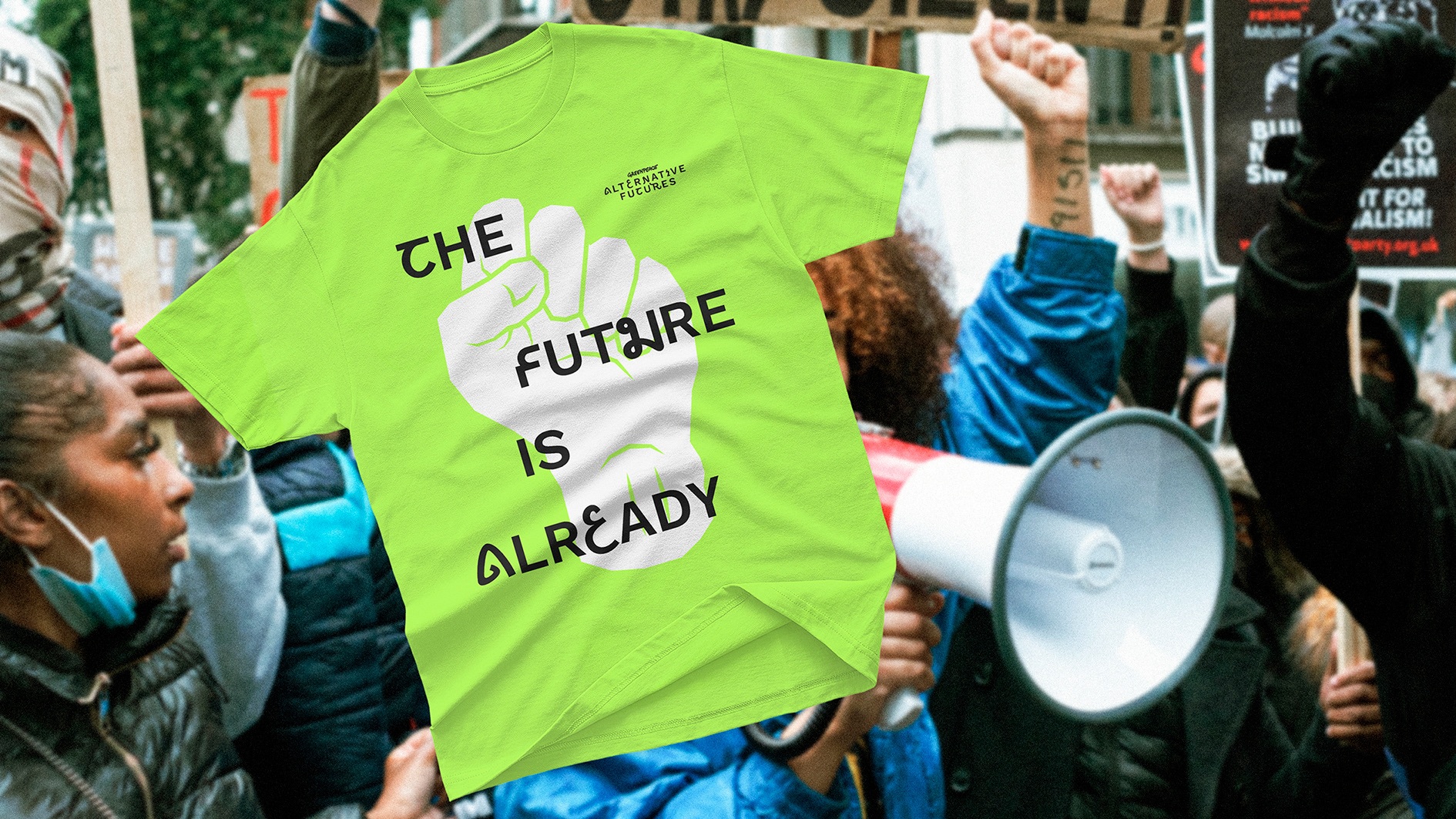
The answer came from one of the most universal and most culturally specific things in any culture: writing. By analyzing writing systems from dozens of languages across the globe, we built two entirely custom alphabets whose characters carry echoes of scripts from Africa, Asia, the Middle East, and the Americas. Not as pastiche or decoration, but as a typographic argument to inspire a sense of belonging in these alternative futures.
The answer came from one of the most universal and most culturally specific things in any culture: writing. By analyzing writing systems from dozens of languages across the globe, we built two entirely custom alphabets whose characters carry echoes of scripts from Africa, Asia, the Middle East, and the Americas. Not as pastiche or decoration, but as a typographic argument to inspire a sense of belonging in these alternative futures.
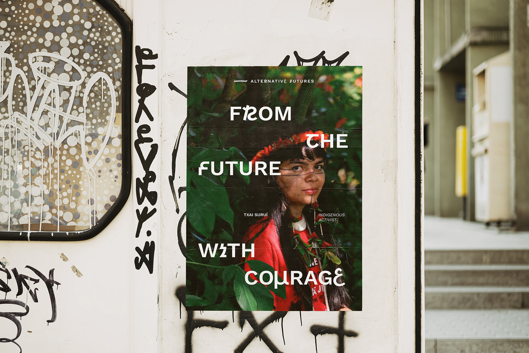
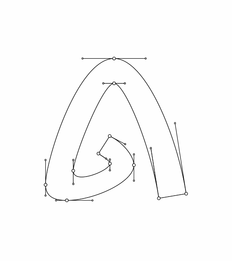
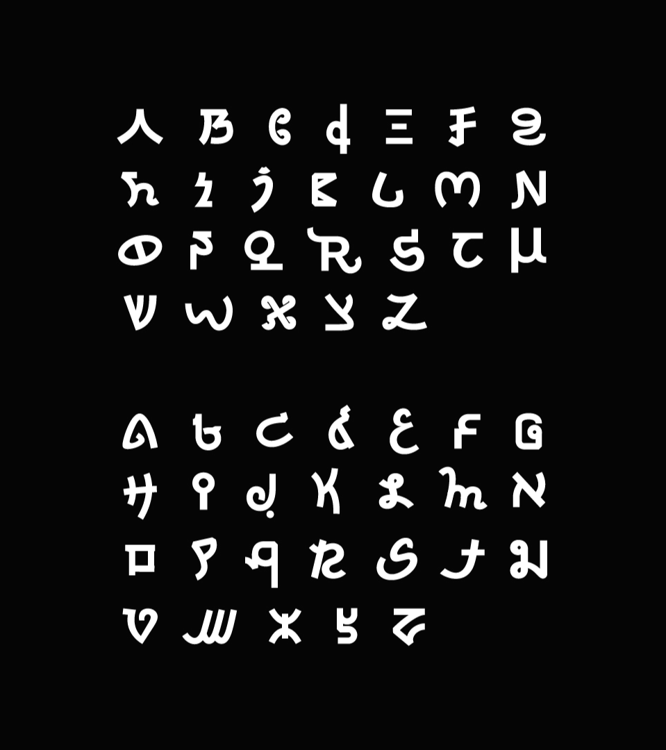
The logo was never meant to be a single fixed mark, since it needed to translate the flexibility and diversity of solutions the campaign celebrates. Its signature varies depending on the audience: the more diverse the generation, the more custom characters appear in the composition, a subtle visual dial tuned to how much unfamiliarity each generation is comfortable leaning into. To make this flexibility accessible to the Greenpeace team themselves, the ones who would actually be using this identity daily without design tools, the alphabet was delivered as a font file, so they could literally type the logo as needed.
The color system follows the same logic of generational range: older generations receive calmer, more conservative palettes, and colors grow more vibrant and high-energy the younger the audience is. These palettes were also built to embrace and amplify the energy of real photography, making images of people, places, and movements from across the world feel like they genuinely belonged inside the same system.
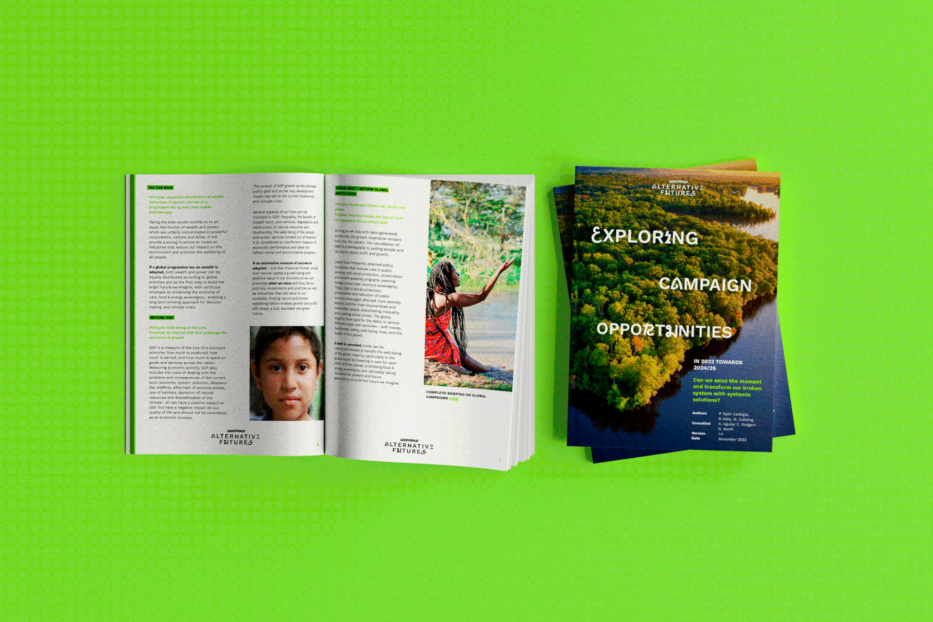
For a global campaign covering multiple topics, geographies, and formats, the visual system needed to be as flexible as the issues it addressed. The grid was inspired by the ratio of meridians to parallels, a structure literally planetary in origin, allowing content to expand and contract without losing coherence across different media and formats.
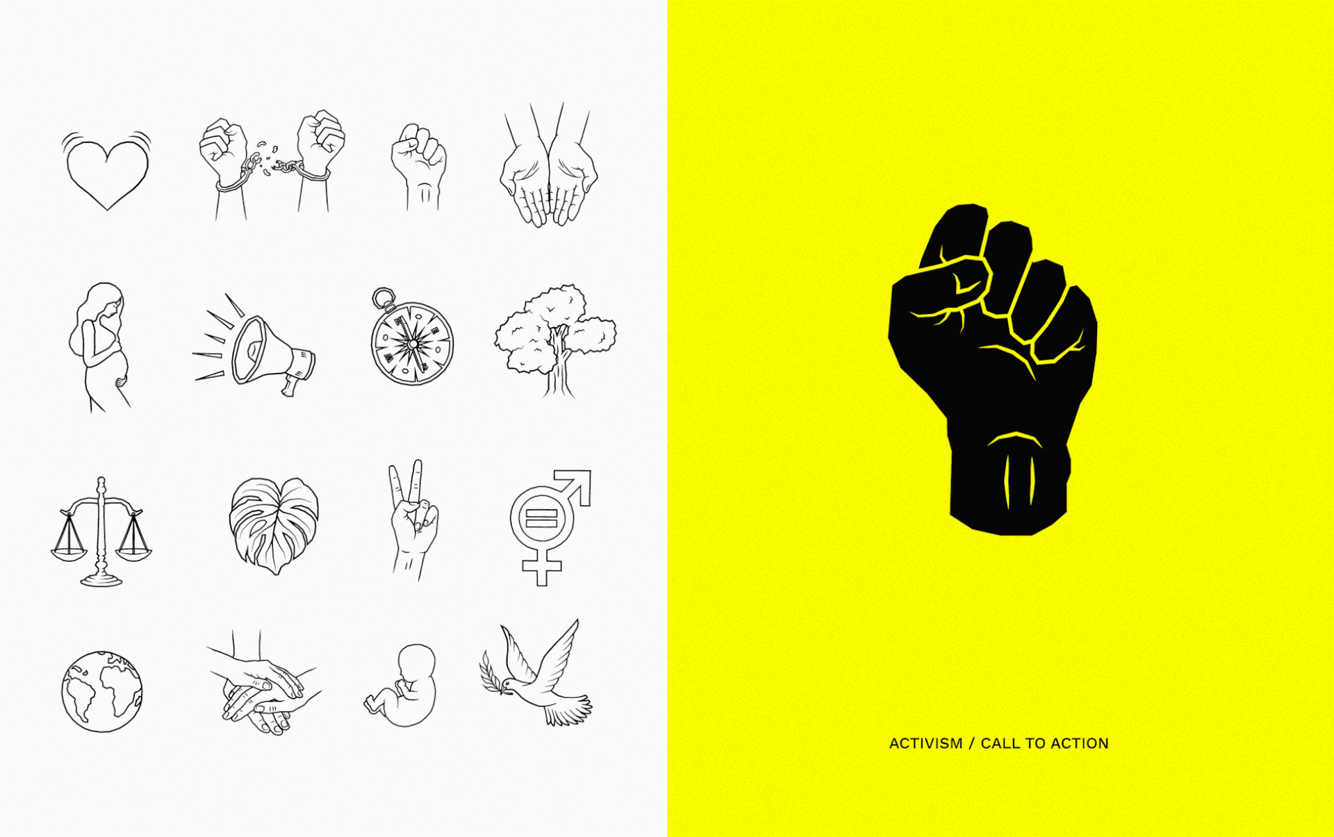
Photography played a central role: real people and real contexts grounded the campaign's more delicate subjects in lived experience, generating a sense of belonging that illustration alone couldn't carry. Bold illustrations then handled what photography couldn't, but since many of the campaign's topics were broad and borderless by nature, they had to work at the same scale: evocative and culturally resonant without being too literal or regionally specific, giving warmth to ideas that needed a different interpretive touch to become tangible.
Photography played a central role: real people and real contexts grounded the campaign's more delicate subjects in lived experience, generating a sense of belonging that illustration alone couldn't carry. Bold illustrations then handled what photography couldn't, but since many of the campaign's topics were broad and borderless by nature, they had to work at the same scale: evocative and culturally resonant without being too literal or regionally specific, giving warmth to ideas that needed a different interpretive touch to become tangible.

CREDITS
Creative Direction & Strategy: Marcos Oliveira
Project Management: Marcos Oliveira
Copy: Manuella Graff
Art Direction: Marcos Oliveira
Design: Marcos Oliveira, Julia Telles, Ana Porazzi, Uinne Régia
Video: Berro Motion
Illustration: Asdrubal Fabris
Logo Refinement: Sauê Ferlauto
Project Management: Marcos Oliveira
Copy: Manuella Graff
Art Direction: Marcos Oliveira
Design: Marcos Oliveira, Julia Telles, Ana Porazzi, Uinne Régia
Video: Berro Motion
Illustration: Asdrubal Fabris
Logo Refinement: Sauê Ferlauto